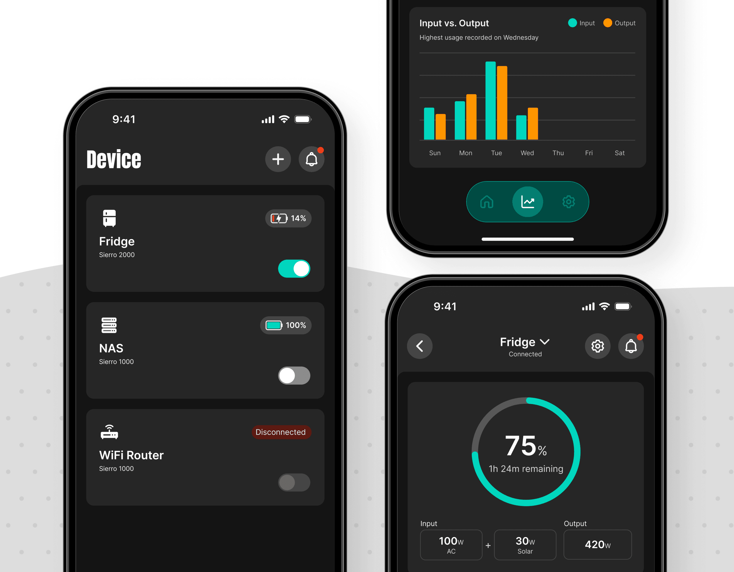
Sierro: Designing the Interface for a Screenless Hardware Product
Sierro: Designing the Interface for a Screenless Hardware Product
Sierro: Designing the Interface for a Screenless Hardware Product
A 0-to-1 mobile experience for a home backup power system, from first-time setup to real-time monitoring and everyday control.
A 0-to-1 mobile experience for a home backup power system, from first-time setup to real-time monitoring and everyday control.
A 0-to-1 mobile experience for a home backup power system, from first-time setup to real-time monitoring and everyday control.
Role
Role
Role
Startup - Solo Product Designer
Startup - Solo Product Designer
Startup - Solo Product Designer
Timeline / Status
Timeline / Status
Timeline / Status
May – June 2026 · 2 months · Pre-launch
May – June 2026 · 2 months · Pre-launch
May – June 2026 · 2 months · Pre-launch
Team
Team
Team
Founder · Engineers
Founder · Engineers
Founder · Engineers
Project Type
Project Type
Project Type
0→1 · Connected Hardware · B2C · Mobile UX ·iOS & Android
0→1 · Connected Hardware · B2C · Mobile UX ·iOS & Android
0→1 · Connected Hardware · B2C · Mobile UX ·iOS & Android

1. Project Highlights
1. Project Highlights
1300+
1300+
Kickstarter backers
Kickstarter backers
$900K+
$900K+
Crowdfunding raised
Crowdfunding raised
End-to-End Ownership
End-to-End Ownership
Owned UX across 5 core modules and 20+ workflows
Owned UX across 5 core modules and 20+ workflows
Production-Ready Delivery
Production-Ready Delivery
Defined interaction specs, states, and assets for implementation
Defined interaction specs, states, and assets for implementation
1. Project Highlights
1300+
Kickstarter backers
$900K+
Crowdfunding raised
End-to-End Ownership
Owned UX across 5 core modules and 20+ workflows
Production-Ready Delivery
Defined interaction specs, states, and assets for implementation
2. My Contribution
2. My Contribution
As the solo product designer, I owned the companion app end to end, from defining core workflows and interaction behavior to creating implementation-ready specifications, reusable components, and launch assets.
As the solo product designer, I owned the companion app end to end, from defining core workflows and interaction behavior to creating implementation-ready specifications, reusable components, and launch assets.
End-to-End UX
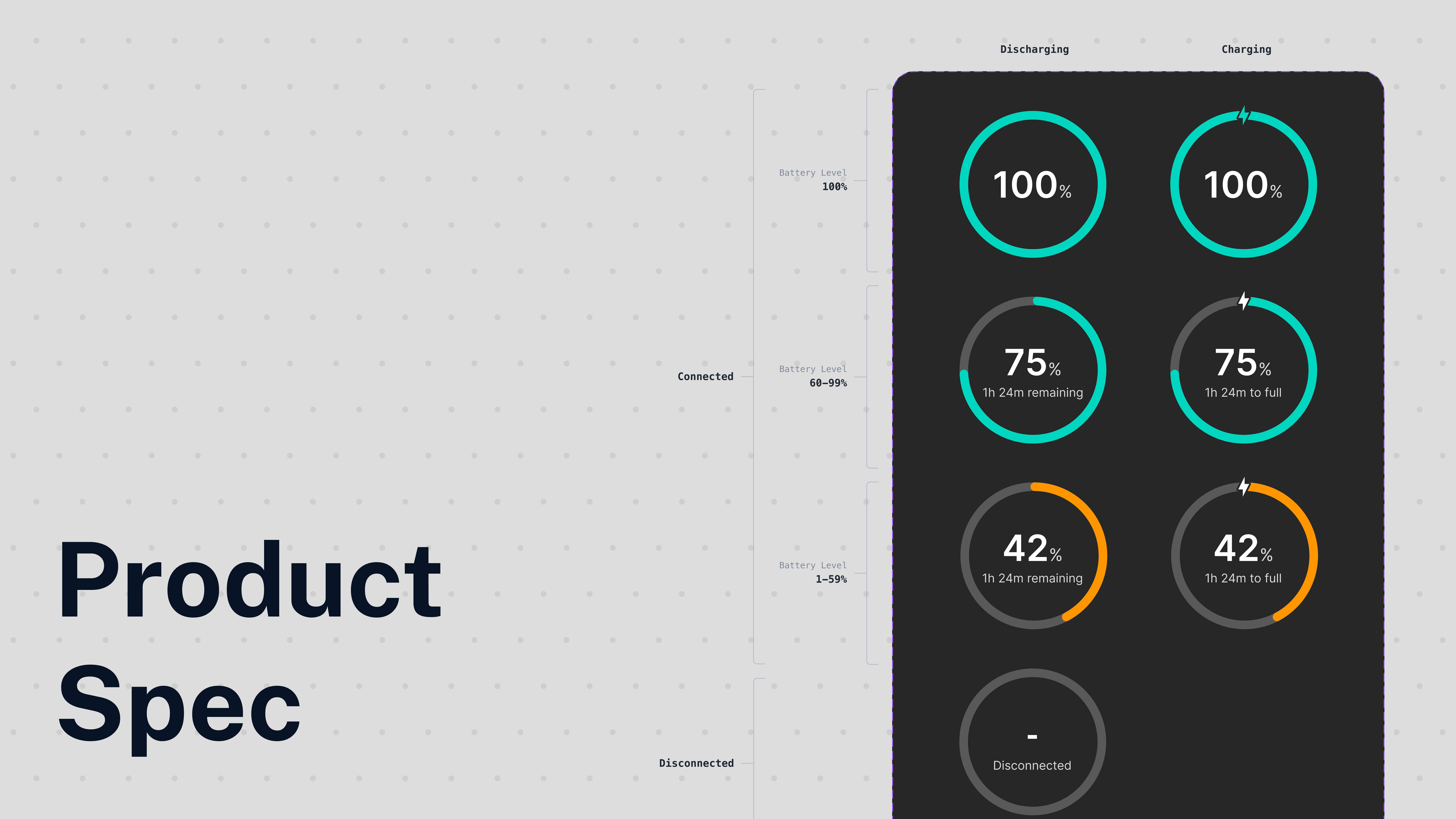
Product Specifications
Launch & Delivery
Designed the complete companion app experience, from first-time setup to long-term device management.
Onboarding
Device Setup
Monitoring Dashboard
Notifications
Settings


UX
Spec
Delivery
Designed the complete companion app experience, from first-time setup to long-term management.
Onboarding
Device Setup
Monitoring Dashboard
Notifications
Settings
2. My Contribution
As the solo product designer, I owned the companion app end to end, from defining core workflows and interaction behavior to creating implementation-ready specifications, reusable components, and launch assets.
End-to-End UX
Product Specifications
Launch & Delivery
Designed the complete companion app experience, from first-time setup to long-term device management.
Onboarding
Device Setup
Monitoring Dashboard
Notifications
Settings
3. Project Context
3. Project Context
Sierro is a home backup system designed to keep essential household devices, such as refrigerators, Wi-Fi routers, and medical equipment, running during outages. Its companion app handles setup, monitoring, and control.
Sierro is a home backup system designed to keep essential household devices, such as refrigerators, Wi-Fi routers, and medical equipment, running during outages. Its companion app handles setup, monitoring, and control.

Why the App Matters?
Why the App Matters?
The hardware itself has no screen or interface. Setup, device status, energy monitoring, controls, and recovery all depend on the mobile app, making software the primary interface to the product.
The hardware itself has no screen or interface. Setup, device status, energy monitoring, controls, and recovery all depend on the mobile app, making software the primary interface to the product.
This made one question central throughout the design process:
This made one question central throughout the design process:
How might we make a screenless hardware system feel clear, understandable, and trustworthy through software?
How might we make a screenless hardware system feel clear, understandable, and trustworthy through software?
How might we make a screenless hardware system feel clear, responsive, and trustworthy through software?
Designing for technical users
Designing for technical users
Early adopters were often familiar with home energy and backup systems, bringing expectations for detailed data and advanced controls. But technical expertise didn't mean the interface could leave behavior unexplained.
Early adopters were often familiar with home energy and backup systems, bringing expectations for detailed data and advanced controls. But technical expertise didn't mean the interface could leave behavior unexplained.
The design needed to offer depth without making complexity the user's problem.
The design needed to offer depth without making complexity the user's problem.
3. Project Context
Sierro is a home backup system designed to keep essential household devices, such as refrigerators, Wi-Fi routers, and medical equipment, running during outages. Its companion app handles setup, monitoring, and control.
Why the App Matters?
The hardware itself has no screen or interface. Setup, device status, energy monitoring, controls, and recovery all depend on the mobile app, making software the primary interface to the product.
This made one question central throughout the design process:
How might we make a screenless hardware system feel clear, understandable, and trustworthy through software?
How might we make a screenless hardware system feel clear, responsive, and trustworthy through software?
Designing for technical users
Early adopters were often familiar with home energy and backup systems, bringing expectations for detailed data and advanced controls. But technical expertise didn't mean the interface could leave behavior unexplained.
The design needed to offer depth without making complexity the user's problem.
4. Design Challenges
4. Design Challenges
01 Guiding Users to Their First Successful Connection
01 Guiding Users to Their First Successful Connection
Problem
Problem
Setup required multiple permissions, but users didn’t need them all at once.
Setup required multiple permissions, but users didn’t need them all at once.
Bluetooth and Local Network were required to connect a device, while notifications became useful after setup. Requesting everything upfront would add friction before users understood why each permission was needed.
Bluetooth and Local Network were required to connect a device, while notifications became useful after setup. Requesting everything upfront would add friction before users understood why each permission was needed.
Design Principle
Design Principle
Ask in context. Explain before requesting.
Ask in context. Explain before requesting.
User Intent
User Intent
→
→
Explain Why
Explain Why
→
→
Request Access
Request Access
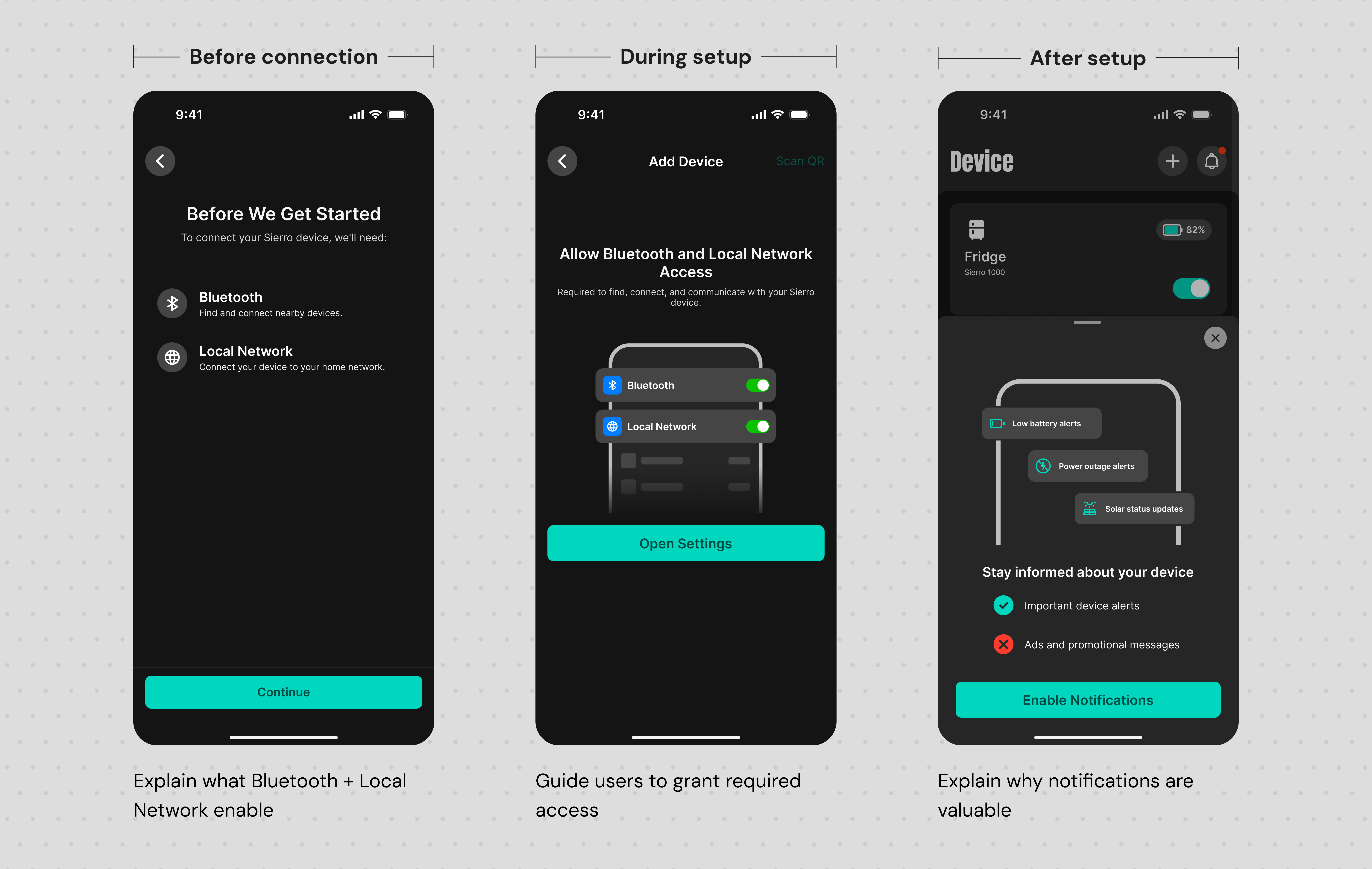
I tied each permission to the action that made it meaningful: Bluetooth and Local Network access when users chose to connect a device, and notifications only after setup, each preceded by a clear explanation of why it was needed.
I tied each permission to the action that made it meaningful: Bluetooth and Local Network access when users chose to connect a device, and notifications only after setup, each preceded by a clear explanation of why it was needed.
From Permission-First to Contextual Requests
From Permission-First to Contextual Requests
Instead of front-loading every permission, I moved each request to the point where users could understand its value.
Instead of front-loading every permission, I moved each request to the point where users could understand its value.

Context Before Every Request
Context Before Every Request
02 Designing Visualizations for Different Monitoring Goals
02 Designing Visualizations for Different Monitoring Goals
Problem
Problem
One visualization couldn’t serve every monitoring goal equally well.
One visualization couldn’t serve every monitoring goal equally well.
Users needed to understand both continuous energy trends and discrete comparisons across different timeframes. Applying the same chart everywhere would either weaken trend readability or make comparisons harder.
Users needed to understand both continuous energy trends and discrete comparisons across different timeframes. Applying the same chart everywhere would either weaken trend readability or make comparisons harder.
Design Principle
Design Principle
Match the visualization to how users read the data.
Match the visualization to how users read the data.
I prioritized the monitoring goal and readability of each timeframe, while keeping interaction patterns consistent where possible.
I prioritized the monitoring goal and readability of each timeframe, while keeping interaction patterns consistent where possible.
Exploration — Comparing Visualization Patterns
Exploration — Comparing Visualization Patterns
I explored how different chart types balanced trend readability, comparison, and visual emphasis.
I explored how different chart types balanced trend readability, comparison, and visual emphasis.

Decision
Decision
Rather than forcing one visualization across every timeframe, or designing a different chart for each, I evaluated where consistency would reduce learning effort and where differentiation would better support the monitoring goal.
Rather than forcing one visualization across every timeframe, or designing a different chart for each, I evaluated where consistency would reduce learning effort and where differentiation would better support the monitoring goal.


The goal wasn't a unique chart for every view, it was choosing where consistency mattered and where differentiation added value.
The goal wasn't a unique chart for every view, it was choosing where consistency mattered and where differentiation added value.
The final experience keeps interactions consistent across all four timeframes, while adapting the chart only when the monitoring behavior changes, continuous trends use Line + Area, while day-to-day comparison uses Dual Bars.
The final experience keeps interactions consistent across all four timeframes, while adapting the chart only when the monitoring behavior changes, continuous trends use Line + Area, while day-to-day comparison uses Dual Bars.
03 Designing for At-a-Glance Device Management
03 Designing for At-a-Glance Device Management

Problem
Problem
Similar hardware made device recognition harder than it seemed.
Similar hardware made device recognition harder than it seemed.
Sierro users may manage multiple similar-looking backup units, each supporting a different household device. The homepage needed to make each one easy to recognize, assess, and control at a glance.
Sierro users may manage multiple similar-looking backup units, each supporting a different household device. The homepage needed to make each one easy to recognize, assess, and control at a glance.
Design Principle
Design Principle
Prioritize recognition, status, and control.
Prioritize recognition, status, and control.
I structured each card around three questions users needed to answer quickly: Which device is this? What is its status? What can I do from here? These priorities guided both the card hierarchy and homepage layout.
I structured each card around three questions users needed to answer quickly: Which device is this? What is its status? What can I do from here? These priorities guided both the card hierarchy and homepage layout.
Exploration 01 — What Best Identifies a Device?
Exploration 01 — What Best Identifies a Device?
Product Image vs. Usage Context
Product Image vs. Usage Context
I explored product imagery as the primary visual identifier, but Sierro’s capacity models share a similar form factor, making them difficult to distinguish at card size.
I explored product imagery as the primary visual identifier, but Sierro’s capacity models share a similar form factor, making them difficult to distinguish at card size.
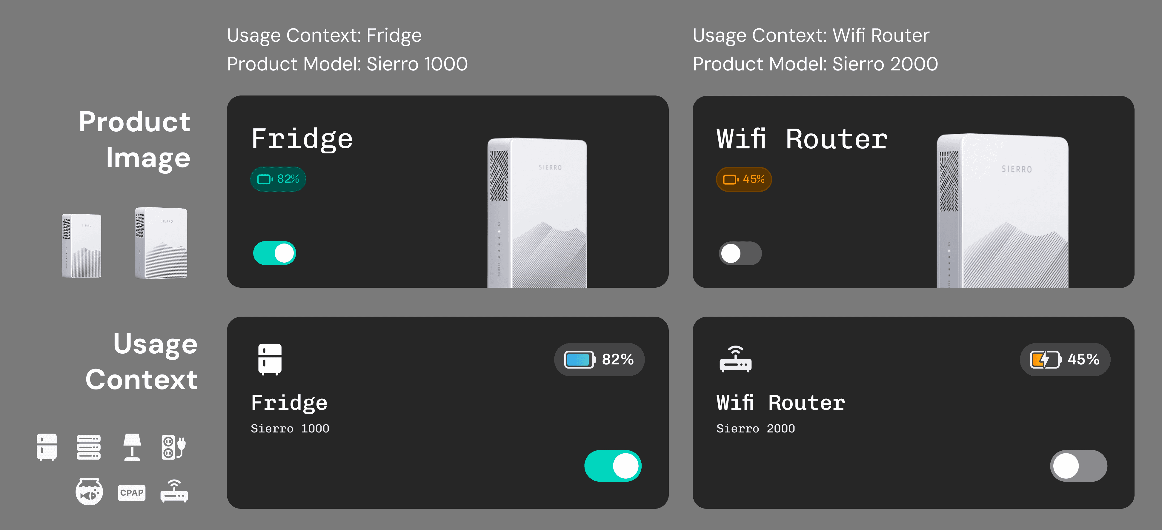

For backup power, what a device protects can be more meaningful than what the hardware looks like.
For backup power, what a device protects can be more meaningful than what the hardware looks like.
Users often buy backup power for a specific need—such as keeping a refrigerator, CPAP, or Wi-Fi router running during an outage. I therefore used configurable usage icons as the primary visual cue, while keeping the Sierro model as secondary information.
Users often buy backup power for a specific need—such as keeping a refrigerator, CPAP, or Wi-Fi router running during an outage. I therefore used configurable usage icons as the primary visual cue, while keeping the Sierro model as secondary information.
Exploration 02 — How Much Density Do Users Actually Need?
Exploration 02 — How Much Density Do Users Actually Need?
With the card hierarchy defined, the next question was how many devices the homepage needed to accommodate at once.
With the card hierarchy defined, the next question was how many devices the homepage needed to accommodate at once.
Design for the typical case, not the theoretical maximum.
Design for the typical case, not the theoretical maximum.
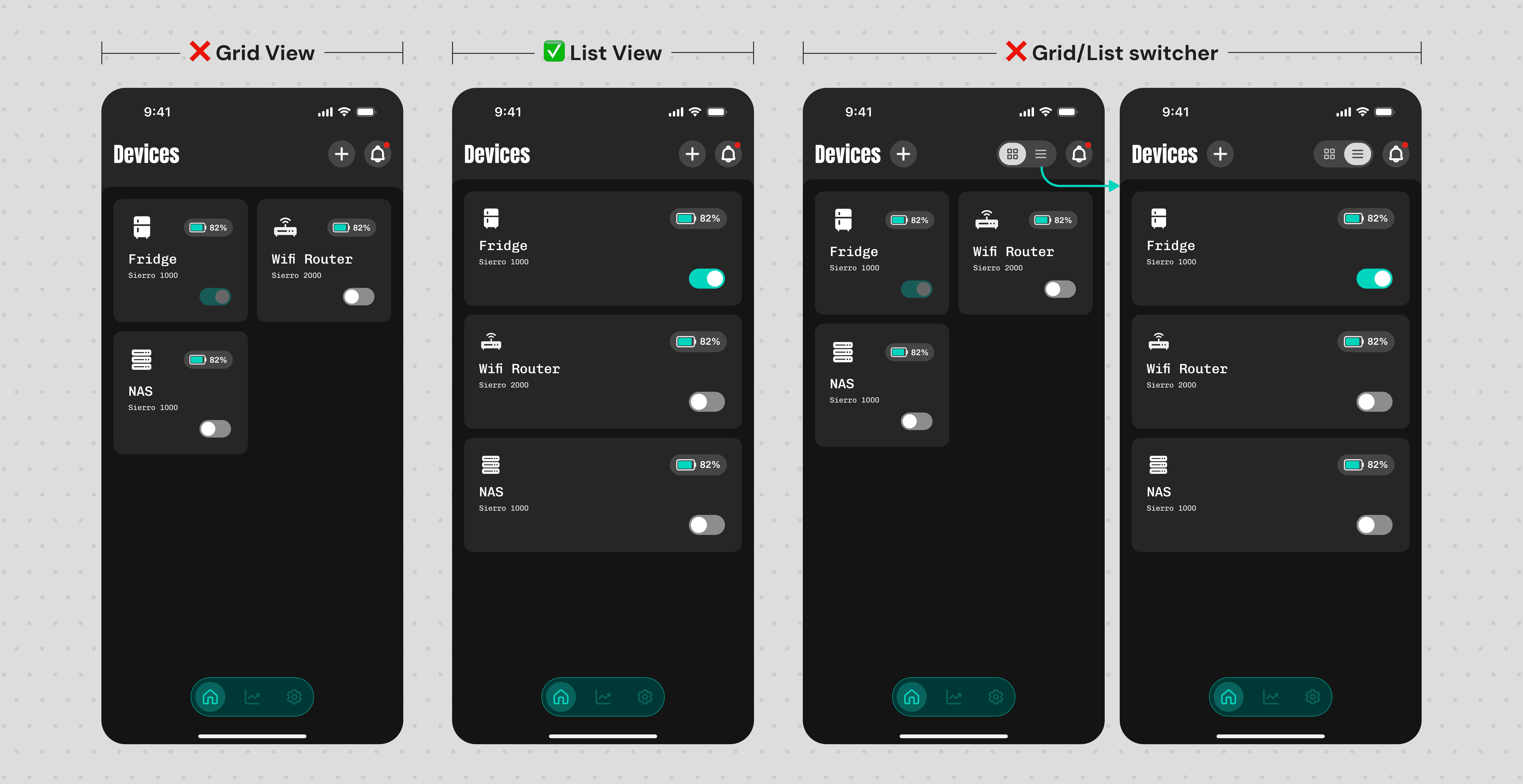
I explored compact grids, larger list layouts, and a Grid/List switcher. But with most users expected to manage only 1–3 Sierro devices, maximizing density added complexity with little value in the typical use case.
I explored compact grids, larger list layouts, and a Grid/List switcher. But with most users expected to manage only 1–3 Sierro devices, maximizing density added complexity with little value in the typical use case.
Final Design
Final Design

A Homepage Built Around the Typical Use Case
A Homepage Built Around the Typical Use Case
The final design combines usage-based recognition with a list layout optimized for the typical 1–3 device setup.
The final design combines usage-based recognition with a list layout optimized for the typical 1–3 device setup.
4. Design Challenges
01 Guiding Users to Their First Successful Connection
Problem
Setup required multiple permissions, but users didn’t need them all at once.
Bluetooth and Local Network were required to connect a device, while notifications became useful after setup. Requesting everything upfront would add friction before users understood why each permission was needed.
Design Principle
Ask in context. Explain before requesting.
User Intent
→
Explain Why
→
Request Access
I tied each permission to the action that made it meaningful: Bluetooth and Local Network access when users chose to connect a device, and notifications only after setup, each preceded by a clear explanation of why it was needed.
From Permission-First to Contextual Requests
Instead of front-loading every permission, I moved each request to the point where users could understand its value.
Context Before Every Request
02 Designing Visualizations for Different Monitoring Goals
Problem
One visualization couldn’t serve every monitoring goal equally well.
Users needed to understand both continuous energy trends and discrete comparisons across different timeframes. Applying the same chart everywhere would either weaken trend readability or make comparisons harder.
Design Principle
Match the visualization to how users read the data.
I prioritized the monitoring goal and readability of each timeframe, while keeping interaction patterns consistent where possible.
Exploration — Comparing Visualization Patterns
I explored how different chart types balanced trend readability, comparison, and visual emphasis.
Decision
Rather than forcing one visualization across every timeframe, or designing a different chart for each, I evaluated where consistency would reduce learning effort and where differentiation would better support the monitoring goal.
The goal wasn't a unique chart for every view, it was choosing where consistency mattered and where differentiation added value.
The final experience keeps interactions consistent across all four timeframes, while adapting the chart only when the monitoring behavior changes, continuous trends use Line + Area, while day-to-day comparison uses Dual Bars.
03 Designing for At-a-Glance Device Management
Problem
Similar hardware made device recognition harder than it seemed.
Sierro users may manage multiple similar-looking backup units, each supporting a different household device. The homepage needed to make each one easy to recognize, assess, and control at a glance.
Design Principle
Prioritize recognition, status, and control.
I structured each card around three questions users needed to answer quickly: Which device is this? What is its status? What can I do from here? These priorities guided both the card hierarchy and homepage layout.
Exploration 01 — What Best Identifies a Device?
Product Image vs. Usage Context
I explored product imagery as the primary visual identifier, but Sierro’s capacity models share a similar form factor, making them difficult to distinguish at card size.
For backup power, what a device protects can be more meaningful than what the hardware looks like.
Users often buy backup power for a specific need—such as keeping a refrigerator, CPAP, or Wi-Fi router running during an outage. I therefore used configurable usage icons as the primary visual cue, while keeping the Sierro model as secondary information.
Exploration 02 — How Much Density Do Users Actually Need?
With the card hierarchy defined, the next question was how many devices the homepage needed to accommodate at once.
Design for the typical case, not the theoretical maximum.
I explored compact grids, larger list layouts, and a Grid/List switcher. But with most users expected to manage only 1–3 Sierro devices, maximizing density added complexity with little value in the typical use case.
Final Design
A Homepage Built Around the Typical Use Case
The final design combines usage-based recognition with a list layout optimized for the typical 1–3 device setup.
5. Design System
5. Design System
5. Design System
As the product grew across multiple workflows, I built a design system with 20+ reusable components spanning foundations, layouts, core components, form controls, navigation, feedback, cards, and visual assets. Beyond reusable UI, the system defined interaction patterns, component states, and behavioral rules to keep the experience consistent and implementation-ready as the product evolved.
As the product grew across multiple workflows, I built a design system with 20+ reusable components spanning foundations, layouts, core components, form controls, navigation, feedback, cards, and visual assets. Beyond reusable UI, the system defined interaction patterns, component states, and behavioral rules to keep the experience consistent and implementation-ready as the product evolved.
As the product grew across multiple workflows, I built a design system with 20+ reusable components spanning foundations, layouts, core components, form controls, navigation, feedback, cards, and visual assets. Beyond reusable UI, the system defined interaction patterns, component states, and behavioral rules to keep the experience consistent and implementation-ready as the product evolved.

6. Reflection & Learning
6. Reflection & Learning
1
1
Design beyond the happy path
Design beyond the happy path
For connected hardware, edge cases are part of the core experience. I learned to map device states and hardware feedback with engineers, then design clear UI responses and recovery paths for each scenario.
For connected hardware, edge cases are part of the core experience. I learned to map device states and hardware feedback with engineers, then design clear UI responses and recovery paths for each scenario.
2
2
Complexity still needs explanation
Complexity still needs explanation
Expert users don't need less explanation, they need better explanation. Designing advanced energy features taught me to first make the system understandable to myself, then surface the right context without oversimplifying the product.
Expert users don't need less explanation, they need better explanation. Designing advanced energy features taught me to first make the system understandable to myself, then surface the right context without oversimplifying the product.
3
3
Clarity before polish
Clarity before polish
The most valuable design work often happened before the polished screens. Defining flows, edge cases, and interaction rules helped turn an evolving product idea into something the team could align on and implement.
The most valuable design work often happened before the polished screens. Defining flows, edge cases, and interaction rules helped turn an evolving product idea into something the team could align on and implement.
6. Reflection & Learning
1
Design beyond the happy path
For connected hardware, edge cases are part of the core experience. I learned to map device states and hardware feedback with engineers, then design clear UI responses and recovery paths for each scenario.
2
Complexity still needs explanation
Expert users don't need less explanation, they need better explanation. Designing advanced energy features taught me to first make the system understandable to myself, then surface the right context without oversimplifying the product.
3
Clarity before polish
The most valuable design work often happened before the polished screens. Defining flows, edge cases, and interaction rules helped turn an evolving product idea into something the team could align on and implement.
Other Works
Other Works
Other Works
Other Works